C1 Magazines
Magazines. 24/09/24
do now
- representation means the action of speaking or acting.
- ? weather it is positive or negative
- a stereotype is a idea or image of somthing?
- 3 there are 2
- ? audiences.
STEREOTYPE
A stereotype is a generalised representation of a person, place or thing.
They are limited and often offensive or used for comedy.
stereotype of
teenager-moody, annoying, emo, deppressed.
football player-young, good looking, boys, good ability, wealthy.
private school boy-posh ,rich, snobby, spoilt.
- they are seen as naughty
- very diverse
REPRESENTATIONS IN MAGAZINES
masthead- the title.
coverines- summary.
main image- catches your eye.
main cover line- the main topic.
puff- promotion that is like a sticker.
colour palette- the colours that is shown.
direct adress- making it seem like its aimed at you.
star vehicle- a film written or produced by a specific star.
do now 1/10/24
- the masrhead is the title.
- the cover line.
- puff is promotion that is like a sticker.
- weather it is positive or negative.
- stereotypes.
cover 1
- bright
- pretty
- smart
cover 2
- confident
- baddie
- powerful
cover 3
- confutable
- summery
- gold
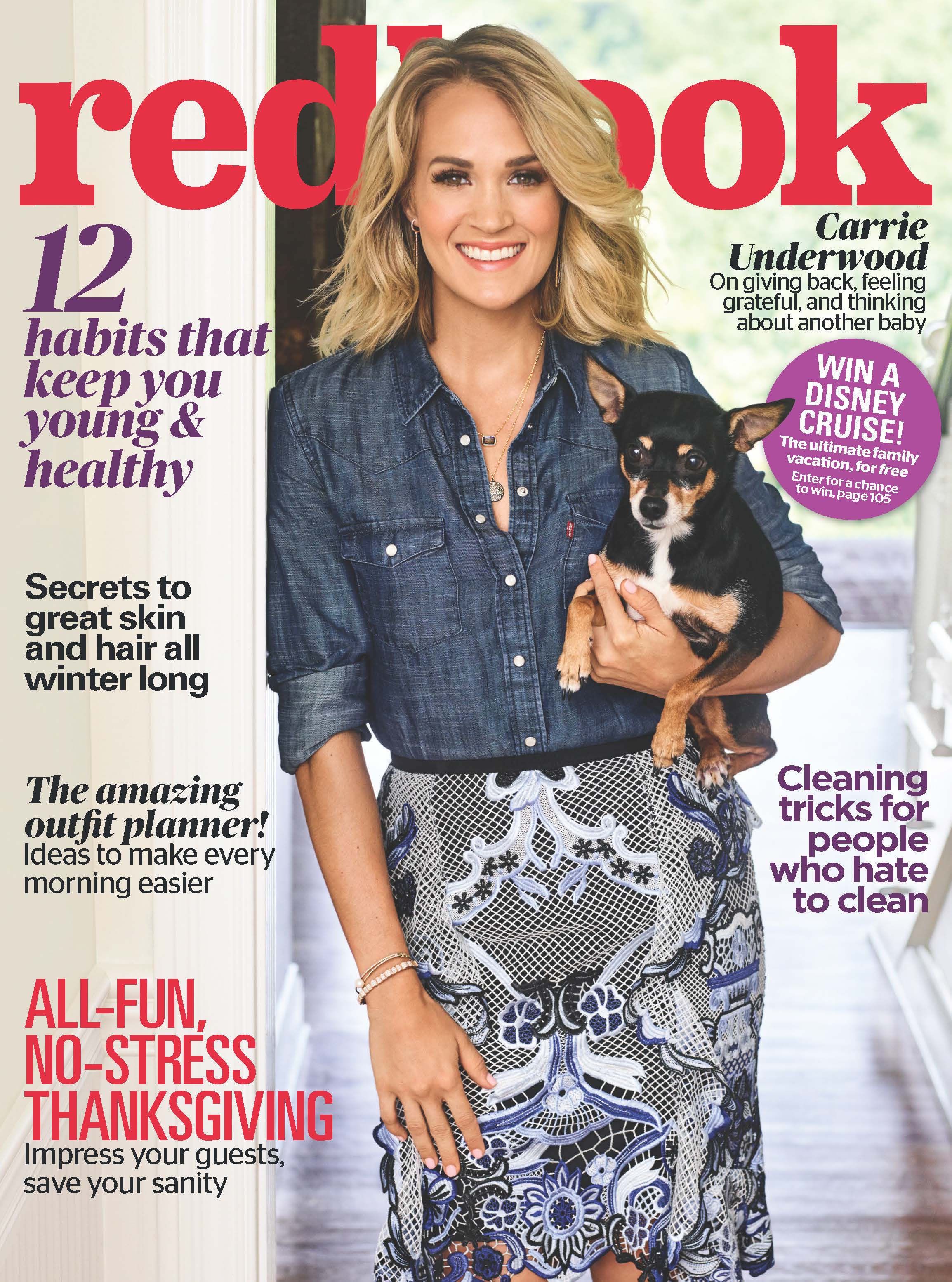
she looks powerful
she looks lively
she looks happy
the dog looks cute
she looks normal
the diffrences between carrie and david
she looks powerful
he looks mysterious
you see her body
you see his face
represented.
in the GQ david beckham is presented as powerful and mysterious, he is also presented as masculine and powerful in a manly way by using sharp font and dressed smartly.also to create that effect, they used dark musk colours. also the way he has his hands together is a very manly and mysterious way.and by putting his wedding ring on show and catching the eye, this shows us that he is respectful to victoria and that he is making it known that he is married and being loyal.And putting David Beckham as the main focus shows us that he is attractive and catches all the attention.
in the womens one, is showing us that its all about the womens body. and saying that we are obsessed with our bodys, men, sex, and how we look. while on the mens one they dont mention sex, bodies or anything.so women are being repersented with just our bodies while the mens one they only have to show there face and not there body while thats the best part of a women.

do now Tuesday 8th October 2024
- big and bold
- something that is aimed at the reader
- puff
- blue
- ? when a person is represented as a object
representation task
do now 15/10/2024
- the title? gender age or sexuality
- ? sexual objectication
- inside game of thrones
- pink
- moody,emo,horrible.
how do you compare representations
lo: to write and structure an effective exam style answer.
simularities
- both use the correct colour
- both represented in kinda the same thing

in that cover David Beckham is represented as stificated, he is presented this way because he is wearing a suit and looks really smart.this makes us think that he has wealth. This contrasts with the cosmo cover. where carrie underwood is represented as fun and sexy. she is presented this way by the way she is presented.she is dressed in a short and colourful dress.
- they have been put on the opposite magazines
- rhiana is being presented as a godess
- and the low angle shot
in the GQ cover Rhiana is presented as medusa. with the snakes ans the no clothes just her arms covering her, she is presented as powerful, godess, mysterious and just beautiful. also the angle that the photo has been taken in makes her look tall and better than everyone else. kind of like she is the boss.
in the cosmo cover Tom Daley is being presented as kind of a girly way,by the way he is dressed and showing his belly. and the colours are kind of girly.
Tuesday 12th November 2024
vogue- vogue was launched in 1892.
- the genre pop.
- more in trend people are being in the magazines.
- it was published by conde nast
- vogue is multi platform
- total circulation 1250 845
- readership- 2.7 million individuals
- target audience- affluent fashion individuals. and females.
- popular, fashionable


GQ
- It was published in 1931.
- The genre is Mens style.
- Yes, more women have been in the magazines.
- The publisher is conde nast.
- It is multi platform?
- The average readership in the uk is 1.8 million and circulation 89,072 in 2021 Men and women.
- male fashion
- sharp,smart
case study 1, GQ raheem sterling
GQ audience consists of mainly of the male population.
GQ represents gender by using men mostly.
Raheem sterling
born 8th december 1994
5ft 8
plays for arsenal
do now Tuesday 19th November 2024
- Conde Nast
- ABC1
- 20-45
- masthead
- a collection of colours in a piece of media
media language
-cover star
-masthead
-cover lines
-anchorage text- text to clarify the meaning.
-lexis-the words used
-typography-how the words look [font]
-brand identity
-image
-colour palette
typography
serif font- feminm, fancy, Vougesans serif font- bold, Boxy, GQ
LIAM GALLAGHER GQ COVER
- block capitals.
- dark natural colours.
- the outfit and glasses make him look powerful.
colour palette
- the main colours are black, white, beige.
- the colour palette is usually 3 or 4 colours used in the magazine.
- Liam Gallagher has been dressed in black to make him look powerful and mysterious.
layout
- the Liam Gallagher magazines layout is not any pattern because the cover lines are arranged around the magazine.
anchorage text
- it proves that if you don't know the person who is on the magazine cover, it says there name and a what they are famous from, it tells us his status and links to him as a [rock and roll star] which links to him and one of him and his brothers songs.
image
-medium close up shot shows us there shoulders and up.
-Liam Gallagher is shot from the shoulders and up.
-the pieces of gold oh his jacket and glasses draw your eyes to it
cover lines & lexis
is brings and mentions the reader by saying {99 ways to look cool this autumn}.
do now Tuesday 26th November 2024
- the words that are seen with an image.
- how the words look and why.
- cover lines.
- sans serif.
- medium close up.
case study #1 Raheem sterling
- born 8th december 1994
- 5ft 8
- plays for arsenal
- he was born in Kingston Jamaica.
- partner: Paige millian
in 2018 after moving to Manchester city he experienced racism from doing a match against Chelsea.when Sterling was only 23 years old when he experienced racial comments, due to this he released a statement highlighting all of the racism that he has experienced in the football world. this also can relate to other football players as lots of football players have been racially attacked with horrible chants, words etc.

The cover of this magazine uses the serif font in the main cover line, we can see this by its in bold and is clearly say angel in a angelic font which makes it look fancy. the masthead is the GQ, they have coloured it in a angelic colour and its in a bold sans serif font. when the masthead and the cover lines are in a rich, wealthy colour in a deep gold colour.this brings our focus to the middle of the magazine. which is sterling.the deep gold brings out sterlings big wings. and the way he is standing makes him look very powerful.and the way they have dressed him up in black wings and black trousers. and people associate angels with white and light because of the sun but they have put him in black wings to associate angels ams black to protect people who are being racially abused.
DO NOW Tuesday 3rd December 2024
- Raheem sterling is a footballer.
- colour and font type.
- racism.
- serif.
- anchorage.
Tuesday 10th December 2024
improvement week
The main image represents a low angle shot shows sterling standing in a confident stance.with a large pair of black wings which indicates that he protects people and religion.He is looking down at the camera as a low angle shot with a serious face and directly addresses the audience.
B) the language used on the front of the magazine cover is very relaxed so you can focus on the main points that the creator is trying to point out. and helps to point out the main image and what they are trying to make aware. The point in this magazine cover is to make everyone aware of how touching and effective towards black people, so to make everyone aware of this is that sterling is stood in a way that wis very powerful and has big black wings on. at the bottom of the magazine in bold text is "Gardian angel".this text links to sterling being a Gardian angel towards black people and to protect them from racism.
DO NOW.💣 Tuesday 17th December 2024
- shows ,tells ,implies✅
- angles✅
- ABC1 men?✅
- to show the readers what they are going to be reading.✅
- ?❌ convention-the way something is done
DIRT WORK
gender👧👦
the cover represents, gender by being confident and powerful the way that they have positioned sterling to stand. He also looks very masculine with his top off.and his wings presents him as supernatural figure suggesting his extraordinary skills on the pitch
ethnicity
the angel wings presents and shows religion. sterling is black and he is being presented as powerful.so with this, this is showing us that all black men and women are powerful.The majority of black people get associated with crime or trouble. But the cover suggests that black people are alot more than that and are not all to do with crime and violence and that really they are powerful and that they are people at the end of the day.
do now👼 Tuesday 7th January 2025
- pop.✅
- women and men. fashion idols.✅
- Conde Nast.✅
- tells the readers what to expect.✅
- kate moss.✅
vogue magazine. case study #2
vogue shows that in the past they only used white British women for there magazine covers. But now vogue have started to have different genders, ethnicity.
malala
-she was shot twice
-once in the head
-and in the neck
-she has lost her hearing in her left ear
who is Malala Yousatzal?
Malala is a 27 year old Pakistani education activist.she was originally born in Pakistan, but currently lives in England.She has been an activist from a young age.When Yousafzai was only 11 years old, her father took her to local protesting clubs to fight for the school closings.(her dad owned the school).she made her fist speech at the age of 11 in 2012. But when she was 15 she was shot in the head on the way home from school. She was in a coma for 10 days and was forced to move out of the country for her safety.
do now. Tuesday 14th January 2025
- Malala is know for surving a shot in the head at 15.✅
- ?
- abc1 females.✅
- no.✅
- no.✅
Malala Yousafzai vogue. media language analysis.
VOGUE
vogue- vogue is that fashion in that particular time.
-serif
-femine
-something that should stand out.
MASTHEAD
-to make it more see able.
-the silver connotes that gold is better and more powerful then gold.but as what she has done the writing beneath her name is 'survivor ,legend' this proves that she is still silver/ good but not as good as gold and isn't like the typical vogue models.
anchorage text
-malala
-because its her name.
layout-z shape
-typical magazine cover.
-all of the red makes her the center of attention.
-the way her hands are positions leads us to her face.
coverlines
-the patters is some are black then white.
-serif font. to keep it to the female and fashion, original vogue font.
-goes from serif to italic font
image
- mid close up
-that the red clothes and background bring our focuses to her.
-powerful
-?
-red could mean blood, sacrifice, danger.
do now💜 Tuesday 21st January 2025
- the z shape✅
- famous boxer✅
- medium close up✅
- direct adress✅
- power, blood, love✅
 firstly, this cover produced by vogue in July 2021.the 27 year old Pakistani education activist, Malala Yousafzai who was born in Pakistan, but currently lives in England.She has been an activist from a young age.in 2012 when she was only 15, she was shot in the head after protesting about equal education for girls.from her past and all of the things she has done for fighting for girls rights to have an equal education as boys in Pakistan, vogue thought it was a good idea to put her on the cover of vogue. to represent her as a survivor, activist and a legend as the words she has been described as at the bottom of the magazine. vogue had positioned Malalas hands on her face to bring all of the attention on her. i think that hey have also dressed her in all red as-well as the background to represent religion in the clothing choice and with all of the red its to bring out her face features and to bring all of the focus to her. Also with the shot they have used (mid close up) is to again bring her face and her hands out, to bring the hands out and make they stand out they have put red gold rings on her hands.
we can see that the main text at the bottom of the magazine is Malala. they have present the Malala text in serif font and in white colour to bring it out and to break up all of the redness of the background and the clothing. and also with the coverlines go in a pattern by black and white.the white text is serif font and is in italics, while the black serif font is just normal and not italic. also under the bold text "Malala" in a goldish/brown colour there are the words "survivor, activist, legend".they have put this underneath her name to remind you and describe what people look at her like and what the represent her as.
the layout that they have used is the z-shape.they have used this to make you looked at the magazine in a the of order. so you go from top to middle and then down to the bottom. so your eyes follow all of the writing while also focusing on the women (Malala) on the front cover.
text/written language.
we can see that the main text at the bottom of the magazine is Malala. they have present the Malala text in serif font and in white colour to bring it out and to break up all of the redness of the background and the clothing. the coverlines go in a pattern by black and white.the white text is serif font and is in italics, while the black serif font is just normal and not italic. also under the bold text "Malala" in a goldish/brown colour there are the words "survivor, activist, legend". vogue have put this underneath her name to remind you and describe what people look at her like and what they represent her as.
do now Tuesday 28th January 2025
- how different things are presented.✅
- .❌if its negative or positive
- muslim✅
- no she is not✅
- power, passion✅
Representation
in the past muslims have been presented as a certain type of people.They always get stereotyped as men and Terriorists.
in terms of ethnicity, the vogue cover shows loads of diversity.
gender representations
- in the past vogue have always represented women as people who are only relatable in fashion.
- Malala is presented as powerful and feminine.
explain how both ethnicity and gender have both been represented on this cover.
Ethnicity is represented in an anti-stereotypical way, for example the main image shows Malala. who is a famous muslim. This challenges stereotype as the way vogue have presented her in the magazine. or even that she is in the magazine because vogues main model or who they use as there magazine cover, as the women are usually white, straight, British or American.For example in the main image of Malala she is being presented as feminine. Vogue have done this by the way she has her hands placed on her face. Its very feminine and the rings adds a more feminine look.It links to Vogue/Malala/The audience because it shows that vogue is valuing there representation because they are trying to build there fans by not keeping to the same type of people on the cover.
gender is represented in a anti-stereotypical way.Far example the cover line titled "fight talk" talks about boxing and the famous boxer Antony Joshua, Boxing is seen as a traditional sport for men, therefore it challenges stereotypes the effect on women.
do now Tuesday 4th February 2025
- diversity✅
- 'fight talk'✅
- powerful and proud✅
- she is represented as a hero✅
- as violent and terrorists✅
comparing
both of the covers show females.
but they are produced by Elle and vogue.
Lizzo is seen as femin
and Kim is seen as powerful

similarities
- both women
- both strong
- both independent
- both wearing red to represent strength
- both represented in a feminem
- both of their names are in bold
- both represent women as intelligent in the coverlines
- both of them are wearing red, silky clothes that represents elegance and wealth.
differences
- broth represent different things
- Lizzo has a long shot to represent her body, Malala has a close up shot to focus on her.
- Malala blends in and Lizzo is very bold


Do Now. Tuesday 11th February 2025
- the similarities and differences.✅
- if you agree or disagree.✅
- 4.✅
- vogue cover✅
- ❌media language or representation.
25 mark question

similarities and differences between Malala and Kim k
differences:
-Kim k is wearing more revealing clothes while Malala is covered up.
-Kim k is presented in natural colours but Malala is presented in just red.
-Kim k is represented in a sexy way because she is wearing more revealing clothes and the way she is standing. while Malala is covered up in all red and no skin apart from her face and hands are showing.
-Kim k is shown in a medium long shot while Malala is shown in a close up mid shot.
similarities:
-they are both represented in a feminin way.
-they both look powerful.
With the two of the magazine covers, in my opinion there are more differences than similarities.
The representation in the two covers is that there are more differences despite that there are still some similarities between the Malala and Kim k magazine covers.
One of the differences that i have found between the two covers is that on the Elle Kim k cover she is being represented as sexy and mysterious. we can see this by the way she has her hands on her bare legs and the way she has positioned herself to be standing, while on the vogue cover. Malala is completely covered up with no skin showing, Malala is being represented as innocent and powerful.By the way she is different to Kim is that she only has her face and her hands showing.
Another way Kim k is represented differently in the Elle magazine is that she is wearing natural colours, the background brings her to attention with a boring grey background, the cover lines are also mostly in white or black but the ones that say "Kim" and "confidence" are in a hot pink to make us focus on not just her but the cover lines about her too.Malala on the Vogue cover is presented in all red. even the background is red to kind of blend her in, and so our focus can go to her face and her hands. The cover lines are also in grey and black.but her name in massive sans-serif bold font, is bright white which is just under her face.
The last way they are different is the shots that they are both been shot in, Kim k has been shot in a medium long shot to show more skin and the clothes she is wearing. While Malala has been shot in a Mid close up. This is to focus on her face and the cover lines around her so people can hear her story while Kim k is regally on magazines, for her wealth, popularity and looks.
Although there are loads of differences, there are still certain things that bring them both to similarities.
Both of the Cover stars are represented in a feminine and wealthy way. They are both made to look feminine-like with the type of poses, outfit choice, makeup etc.But the main way that they are represented as feminine is the facial expressions. Kim k has got an expression which connotes that she rules the world and is very serious, so dose Malala. she's smiling directly at the camera. This connatests that she is powerful.They also both look wealthy, the way we can see this is how vogue has got Malala to position herself. she has her hands on her face looks elegant and rich, this creates an image and idea in our head that she is that way because the way her hands are she looks gentle.we can also see her rings on her hands with look expensive. She also is wearing silky clothes, and silk is stereotyped as a wealthy and elegant material. While with Kim k she represents as wealthy because everyone knows that she comes from a wealthy family. And the way she looks powerful can lead that she is wealthy because she's powerful and got that control.
Overall, i think that there are more differences than similarities which i think is a good thing. Because not everyone wants to see Kim k always on a magazine or people being represented as her.But because Malala is on the magazine cover because of her story and what she has been through is completely different to why Kim k is on the magazine cover.
DIRT. Tuesday 4th March 2025
25 MARK COMPARISON Q: 16/25 Good work!
WWW: you’ve clearly identified differences and analysed them
EBI: try including CONNOTATIONS in your explanations
TARGET 1: Add more detail to your answer
DIRT: Re write paragraph 5 using the DEL structure & connotations
WWW: you’ve clearly identified differences and analysed them
EBI: try including CONNOTATIONS in your explanations
TARGET 1: Add more detail to your answer
DIRT: Re write paragraph 5 using the DEL structure & connotations
DEL
d- describe
e- explain
l-link
Tuesday 1st April 2025
assessment dirt
Question 1- 5 mark Question = 2 points.
Question 1d (layout and design)
The vogue magazine follows the typical magazine conventions. The z-shape layout is highly common on magazine covers as its the typical way people read magazine covers. This can connote that Vogue have used this design to present Malala in a powerful and independent way, implying that when us as readers will use the z-shape method and will see Malala presented in some type of way.The design of the magazine uses a specific colour pallet. bright and to contrast with some dark parts of the image.Another way the design has been presented is by putting Malalas head behind the vogue masthead.this could convey that Malala is enough to be a vogue model.
2a) social context= what was going on in society at the time a text was written
Social contexts influences magazines because of what was happening at the time and what is relevant to society.one example of this is is on the Vogue magazine cover, This magazine was made after lockdown. and this is relative to people because on of the cover lines it says "love after lockdown".This is interesting towards the reader at this time because that was what was happening.
Ethnicity is a characterisation of people based on having a shared culture.(race)
Good notes.
ReplyDeleteREPRESENTATION TASK: Great cover, clearly showing an understanding of representation. Look at layout conventions though.
COMPARISON TASK: A good first attempt. Some comparison supported by reference to the two texts.
INDUSTRY RESEARCH: Good notes but Vogue needs completing
GQ COVER ANALYSIS: Great work!
WWW: You’ve clearly analysed elements of media language
EBI: make sure you include detailed reference to the cover with accurate terminology
VOGUE COVER ANALYSIS: Brilliant – much better!
WWW: You’ve clearly analysed elements of media language using detailed examples
EBI: try including CONNOTATIONS
25 MARK COMPARISON Q: 16/25 Good work!
WWW: you’ve clearly identified differences and analysed them
EBI: try including CONNOTATIONS in your explanations
TARGET 1: Add more detail to your answer
DIRT: Re write paragraph 5 using the DEL structure & connotations